

Transport Sector Health Index (TSHI)
What is the TSHI?

The TSHI is a comprehensive benchmark assessing the performance of transport systems across Europe.

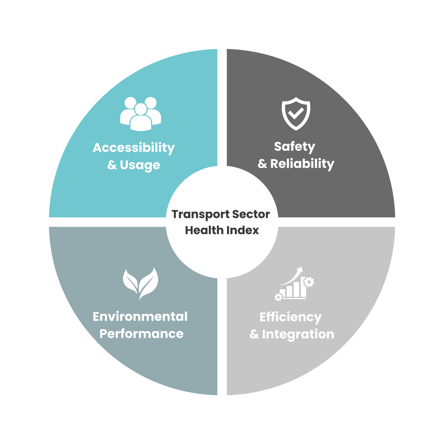
It combines 16 publicly available indicators into four equally weighted dimensions from official, publicly available sources.

It produces a single composite measure to enable meaningful comparisons between countries.
A2. Network accessibility index
A3. Share of buses and trains in inland passenger transport
A4. Affordability of public transport
S2. Serious road injuries per billion vehicle-km
S3. Share of vulnerable road users in total road fatalities
S4. Rail service punctuality and reliability
E2. GHG intensity of passenger and freight transport
E3. Share of low- and zero-emission vehicles
E4. Air pollutant emissions from transport
F2. Multimodal freight/logistics efficiency
F3. Urban congestion and travel time reliability
F4. Digital and data integration in transport
How Healthy is Your Country’s Transport System?
The TSHI combines 16 indicators from official, publicly available sources into four equally weighted dimensions. Together, these four dimensions provide a comprehensive assessment of transport system performance.

Accessibility & Usage
Measures how easily people can reach destinations through accessible and effective transport services.
Safety & Reliability
Evaluates transport safety outcomes and the reliability of transport services and infrastructures.
Captures the environmental impact of transport and overall sustainability performance.
25%
25%
Environmental Performance
25%
Efficiency & Integration
Reflects the efficiency and quality of transport infrastructure and integration across transport modes.
25%



Key Statistics (2026)

Countries Assessed
32
Lowest Performer
Croatia


Countries Ranked
24
Average Score
56.2


Top Performer
Finland
Indicator Coverage
97.9
Overall Ranking (2026)
Top & Lowest Performers (2026)
Geographic Coverage (2026)
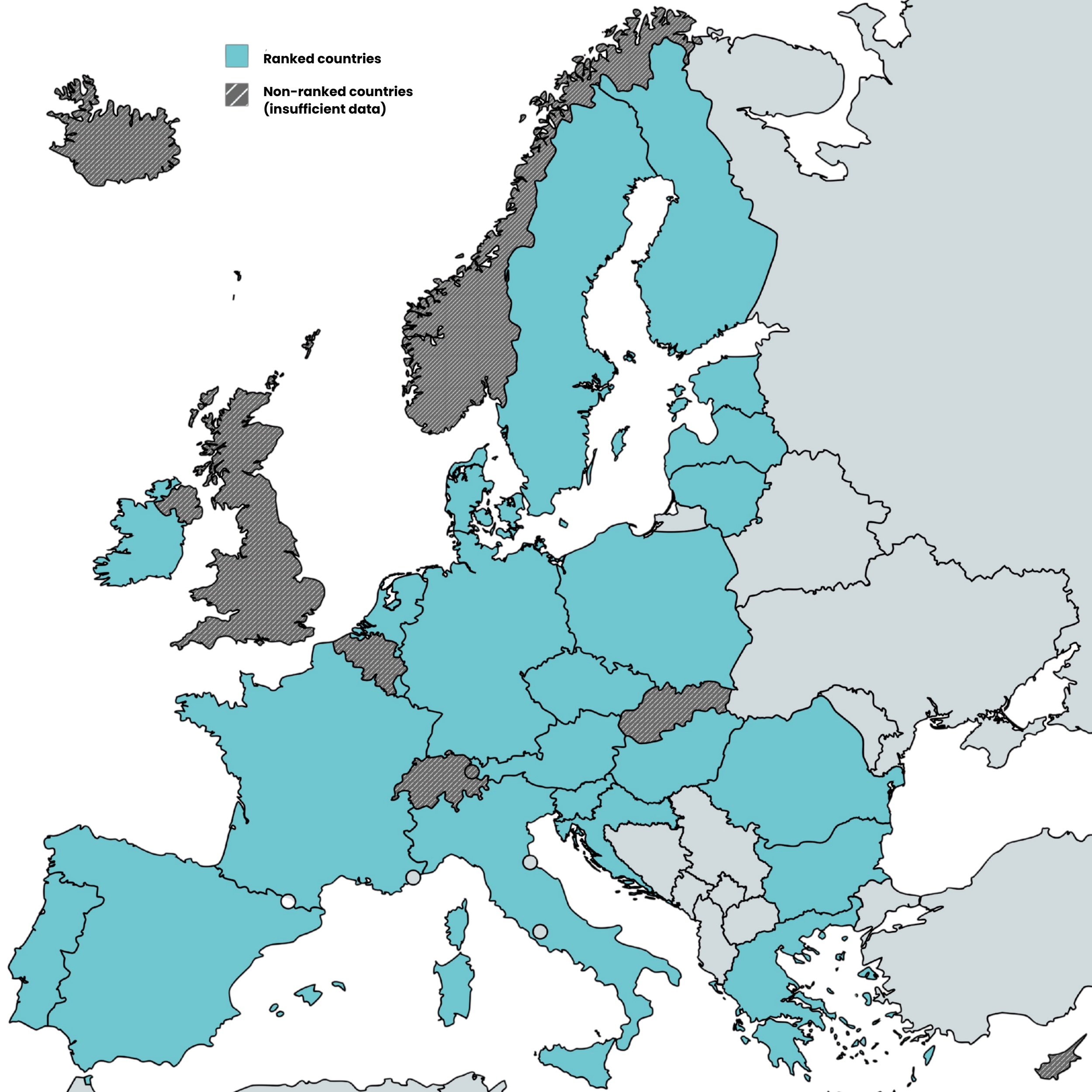
Eight countries could not be ranked due to insufficient publicly available data.
Explore the methodology